
Preparing colour image files for print - Book Production Blog
In a world where images exist largely in the form of digital files the concept of Colour Management in design and print production provides the basis for meaningful comparison between images viewed on screen and then reproduced as proofs or the finished printed result.
Within design and content creation responses to a mention of the concept range, in my experience, from ‘What’s that?’, to a belief it’s entirely the responsibility of the printer to reproduce colour images as, the client would see it, accurately.
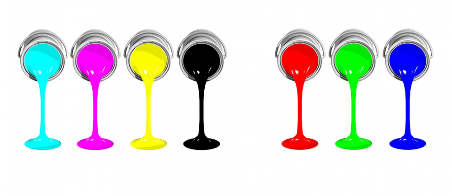
The printing press is a wonderful piece of technology and engineering. Ultimately it’s ability to change the printed result is limited to increasing or reducing the levels of inks in four standard colours (CMYK). The scope for design and pre-press to influence what the press can give you is, however, enormous. The preparation starts way before a printer gets involved, with the handling and preparation of image and design files. Good colour management is an crucial part of creating high quality files for print.
‘Only printers need to know about that’
At its most technical level Colour Management is way beyond the day-to-day understanding of those of us working around, but not actually in, pre-press and print. It can seem a minefield of acronyms and jargon best left to the specialists. In fact everyone in the workflow of a printed product can and should carry responsibility for making it work. You don’t have to be a hard-core techy to do your bit to ensure the best results.
There is no way an image ‘should’ look
Given that images being used in design are these days digital files, rather than prints or transparencies as in days of yore, there can be an expectation an image file, the data, speaks for itself. There is sometimes a perception an image ‘should’ look a certain way in print, based on how images look when viewed on the user’s screen.
This is a myth which needs busting. If not managed correctly from the point the image is captured files no more speak for themselves than any alpha or numeric character in a set. A given letter or number can be recognised as such, but with the use of any different typeface or font it can be displayed in any number of variations. Some of those are pretty similar, some very obviously different. The character is displayed relative to the typeface and font being used. Similarly, colour images are displayed relative to the monitor they are being displayed on and also to the colour profile being used to interpret the data contained within the file. More on these later.
If you haven’t implemented at least the basics of colour management and you comment to a repro company or printer that an image ‘should’ look like this or like that, they’ll be polite but don’t be surprised if they mutter to themselves as soon as you’re out of earshot.
Why is knowing nothing about colour management a problem?
The mechanics of this cannot be left to somebody downstream. Photographers, Designers, Editors and any others handling image files (even if just opening them to have a look before forwarding them on) are possibly, if they have no appropriate colour management protocols in place, unwittingly changing the colour profile supplied embedded in the image file to a default installed on their machine. This will cause the colour and other visual characteristics of the file to shift. Whether the brief is to accurately reproduce a photographer’s shot or a heavily artworked image I think we can all agree this isn’t ok. It’s very easily done.
Within a studio this could be happening multiple times if files are worked on by different people and/or across machines of different specs with different colour settings running in the background. This can cost time and money in corrective re-touching and re-proofing to put things back the way they ‘should’ be. It can cause tension in a relationship with a print supplier or just result in disappointing print. There are some pretty simple starting points for addressing this.
Hardware and software both affect colour
Standard-issue Mac and PC screens, although they can give you brilliant colour for online or other digital content, really aren’t accurate enough when assessing colour for print.
I am not about to suggest an immediate purchase in the form of an industry standard colour-accurate monitor such as you might see in a repro studio or a printer’s pre-press department. Having said that, use of a specialist monitor with a device to regularly calibrate it is truly what you need in order to comment, with any certainty, on how things ‘should’ look.
Top end hardware isn’t within the budget of every freelance or agency designers, it’s fair to say. Having said that, lower-end models are available which are way better for assessing colour, and worth considering. What’s more there are working practices more fundamental than a fancy screen which you should put in place whether or not you have the best hardware available.
Essentially everyone handling the files should have appropriate Colour Profiles and Settings set up in their design applications. Using the now ubiquitous Adobe suite of packages it is straightforward, and free, for anyone to get to this point.
What are colour profiles?
In our context, of preparing digital files for print, ICC colour profiles model the colour potential of particular types of RGB device (cameras, monitors etc) and types of CMYK printing (Litho sheetfed, Web offset, Digital etc) on different substrates (coated paper or uncoated paper, for example). Managing colour for different combinations of print processes and substrates therefore requires the use of Colour Profiles, both RGB and CMYK, which are appropriate to them.
Colour profiles can be embedded in TIFFs*. Embedding the correct CMYK profile for your project therefore displays the image as it would look in the context of a specific type of printing on a specific category of paper. The same image file viewed in Photoshop, using a selection of different profiles, will look visibly different in turn because the data in the file has been interpreted differently by each of the profiles you’ve tried. Referring back to my previous analogy, you can re-interpret images with profiles in the same way you can re-interpret the same letters or numbers with different typefaces. Various print-related performance factors such as print process, dot gain and paper type are reflected in any given profile, so using the correct one matters. It’s not simply a question of choosing the one you like best.
This all relates (in Europe at least) to the ISO/FOGRA system, which comprises a set of approved colour profiles and agreed industry standards for achieving accuracy in digital proofing and printing.
RGB to CMYK conversions and colour gamuts
RGB image files will need to be converted to CMYK before they can be printed. Using appropriate profiles enables us to manage the conversion of those images from RGB colour into CMYK by enabling a realistic on-screen preview of the CMYK outcome of a given RGB image.
RGB has a much larger colour gamut than CMYK, so some loss of colour is often the case as a result of the conversion. Using appropriate combinations of profiles will give you the smoothest transition and a much better idea of how it ‘should’ look in CMYK, when you’re viewing on screen. A skilled operator will make use of this ‘soft-proofing’ on screen and use the tricks of their trade to make adjustments and get the best result in CMYK.
When using the Gamut Warning in PhotoShop you can see what issues a particular image presents when converting between the two profiles. Even without all the hardware investment needed to convert to CMYK at the highest level of accuracy it’s hugely beneficial to our understanding to be able to preview, on an image by image basis, the kind of conversion issues which can arise.
*and other image file formats too, but for halftone images intended for print you should really be using TIFFs and really NOT using JPEGs.
Your Adobe suite set-up
The choice of profiles must be agreed with your pre-press and print suppliers at an early stage of your project. Everyone handling the files should be geared up to manage the files in the right way.
The best way to manage colour across the Adobe suite is to synchronise the profiles and settings across the packages to ensure consistent practice.
How to get started with managing colour files
If you aren’t building colour management into your systems from the very beginning you’re taking some chances and limiting what you can achieve. Using the correct profiles and settings are really just the basics. Without having them in place you can’t meaningfully prepare your content and then compare the results on screen, on proofs and then in print.
Whether you are producing work at the lower or higher end of colour sensitivity you should investigate and implement the profiles appropriate to what you’re doing. You can expect a smoother workflow, fewer colour-related issues or disappointments, arguments and unexpected costs.
You can contact me if you’d like me to consult on anything further, to manage or help with a project.
Download my guide to installing colour settings and profiles in the Adobe desktop publishing suite
If you found this blog useful then…[kofi]
Have a look at the books and other resources I recommend to support your publishing journey. Click the button to visit my dedicated resources page.
Sign up to my newsletter for discounts, new products, freebies, products and news.
Recent Comments
[…] using unless you ask. There are ISO standards for inks the same as there are for other aspects of colour quality management. Based on my experience there isn’t a valid case that fossil-oil based inks give a quality […]
Leave a comment